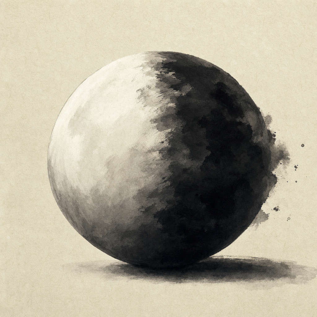
Chiaroscuro
- Light gradient reads as volumenot yet tested
- Caravaggio's near-black dramanot yet tested
- From sfumato to film noirnot yet tested
Chiaroscuro — Italian for light-dark — is the technique of using strong contrasts between illumination and shadow to model form, suggest depth, and orchestrate emotional intensity in a two-dimensional image. Its essence is modelling: a figure gains roundness and weight not from its outline but from the way a directed light rakes across it, leaving one side bright and the other sunk in shadow. Leonardo da Vinci theorized and refined it in late-15th-century Italy, where it grew apart from the soft, edgeless transitions he himself pursued; Caravaggio (~1600) pushed it to its extreme, painting figures emerging from near-black backgrounds with single dramatic light sources, as if a lamp had been struck in a darkened room. The technique is one of the fundamental visual grammars of Western art — a way of converting flat pigment into volume, focus, and drama — and most cinematography, photography, and graphic design still depends on it.
Before chiaroscuro, late-medieval and early-Renaissance painting tended to use flat lighting and outline-based modeling — figures were defined by line rather than tonal value. The Italian innovation was to recognize that the eye reads volume from light gradient — that a sphere on a flat page becomes a sphere when shaded with a smooth tonal transition from highlight to shadow. Leonardo's sfumato — the smoky transitions of the Virgin of the Rocks and Saint John the Baptist — softened the gradients, dissolving every edge into atmosphere; Caravaggio's tenebrism (extreme darkness with sharp single-source illumination) made them theatrical, so that a beam of light becomes the true subject and the rest of the canvas sinks into near-total shadow. The decisive lever in both cases is the single light source: when illumination arrives from one direction, the gradient it casts tells the eye exactly where each surface turns, and the unlit remainder concentrates attention and feeling on whatever the light has chosen. Rembrandt extended the vocabulary in The Anatomy Lesson and The Night Watch, letting a warm glow pick faces out of a brown dusk; Georges de La Tour reduced the whole scene to the trembling light of a single candle; the Spanish Baroque pushed devotional tenebrism (Velázquez's Old Woman Frying Eggs, Zurbarán's Saint Francis in Meditation); the Dutch Golden Age mastered single-window naturalism in Vermeer's The Milkmaid. The cinematographic descendant is low-key lighting: film noir's dark detective offices and the morally ambiguous shadows of The Godfather (Gordon Willis, sometimes called the Prince of Darkness), while Frank Miller's Sin City is essentially Caravaggio with a brush pen and every physically-based 3D renderer now produces chiaroscuro automatically. The technique has remained central across every visual medium for five centuries because it solves a fundamental perceptual problem: how to make a flat surface read as a three-dimensional world that the viewer cares about.